|
 Creating
the right colour scheme for your room
is no easy task. Let our expert guides
help you make the right decision. Creating
the right colour scheme for your room
is no easy task. Let our expert guides
help you make the right decision.
Tonal scheme
A tonal scheme or monochromatic scheme means you use just one colour but in varying tones. If you choose everything in the same tone and colour your scheme will look bland.
The key with this look is to use texture and pattern to alleviate the potential boredom of using one colour.
Some Suggestions
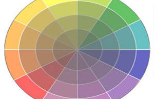
On the wheel , look at the segment showing just one colour. On the outside are the pale tones, which graduate into the middling tones and on into the deeper tones in the centre.
Choose three tints and shades of the same colour and use it throughout the room set.
Use the deepest nearest the floor and the lightest on the ceiling, this gives the illusion of space. If you try it the other way round the room seems to shrink.
Harmonious scheme 
A harmonious colour is one that sits next to another on the colour wheel or very close to it for example, red is near rust, which is near terracotta.
It's very easy to create a balanced, unified scheme that is pleasing to the eye using harmonious colours.
Some Suggestions
Choose colours of similar densities for a balanced look so one doesn't overpower another.
Pick three or four colours that all stem from the same primary colour.
Make the scheme bolder by going for a deeper more intense shade.
If one of your harmonious colours happens also to be a primary colour the effect will be more striking, for example, red and hot pink or red and orange.
Complementary colour scheme
Complementary colours are ones that are opposite to one another on the colour wheel. These colours are naturally made to 'go' with one another - think of the red and green of an apple, or the purple and yellow of an iris.
They tend to be bolder and more dramatic than harmonious schemes.
Some Suggestions
Choose your first colour and look directly at the colour opposite. That is your second colour.
Decide which of the two colours you want to feature more. If you use them both in equal amounts, they will fight for attention and cancel each other out.
If you're nervous about using dramatic colours in reality, try introducing a complementary scheme in the form of a throw or accessory before you go ahead with an actual paint colour.
You can use a third colour - preferably in a different tone from the other two but don't have more than three colours.
Balance the scheme by introducing some neutral colours as well such as cream or white.
Pairing one dark and one light tone of each of your two colours can work well. Experiment with it in both combinations, for example, try a light soft grey with a vibrant deep pink. Then try it the other way around - put together a deep slate charcoal grey with a sugared almond pink.
|
